

A "truth" that will live in infamy — encapsulating the distorted lens through which MAGA perceives the state of the United States.
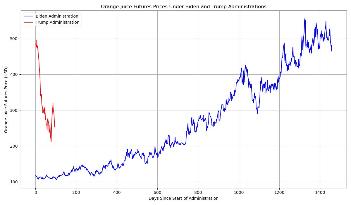
Updated at least on the 1st and 15th of each month, and usually more, these charts track the Day-1 economic progress of the current administration compared to its predecessor (Because that's how they forced you to view it). Covering everything from consumer sentiment to job growth, they aim to present clear economic trends — no spin, just data. Note that FRED data in some of these charts may be 1-2 months old, and will update when the data source updates.
This project is evolving — expect a mix of real data comparisons and lighter content, depending on what the daily drip of chaos inspires.
For a sharp and entertaining take on the latest happenings in Washington and beyond, check out the blog What The Fuck Just Happened Today? — it's been a great resource for keeping up with the madness.
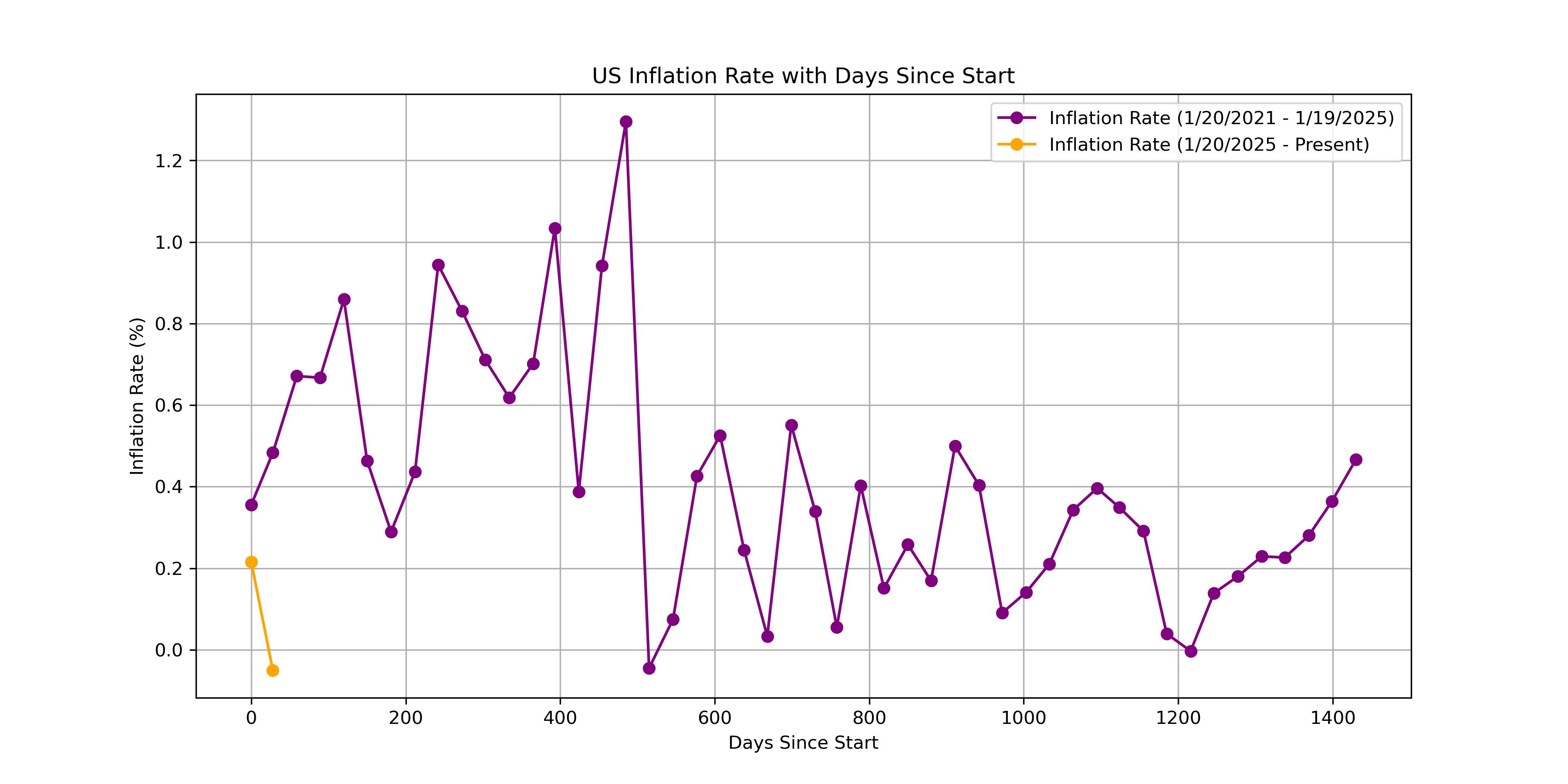
Inflation Rate chart
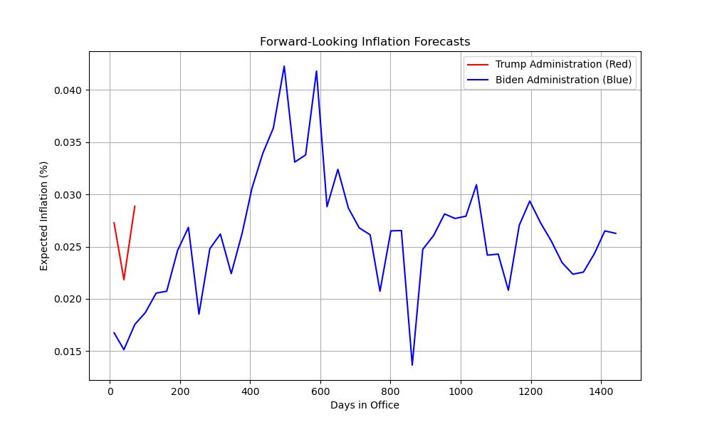
Inflation Forecasts
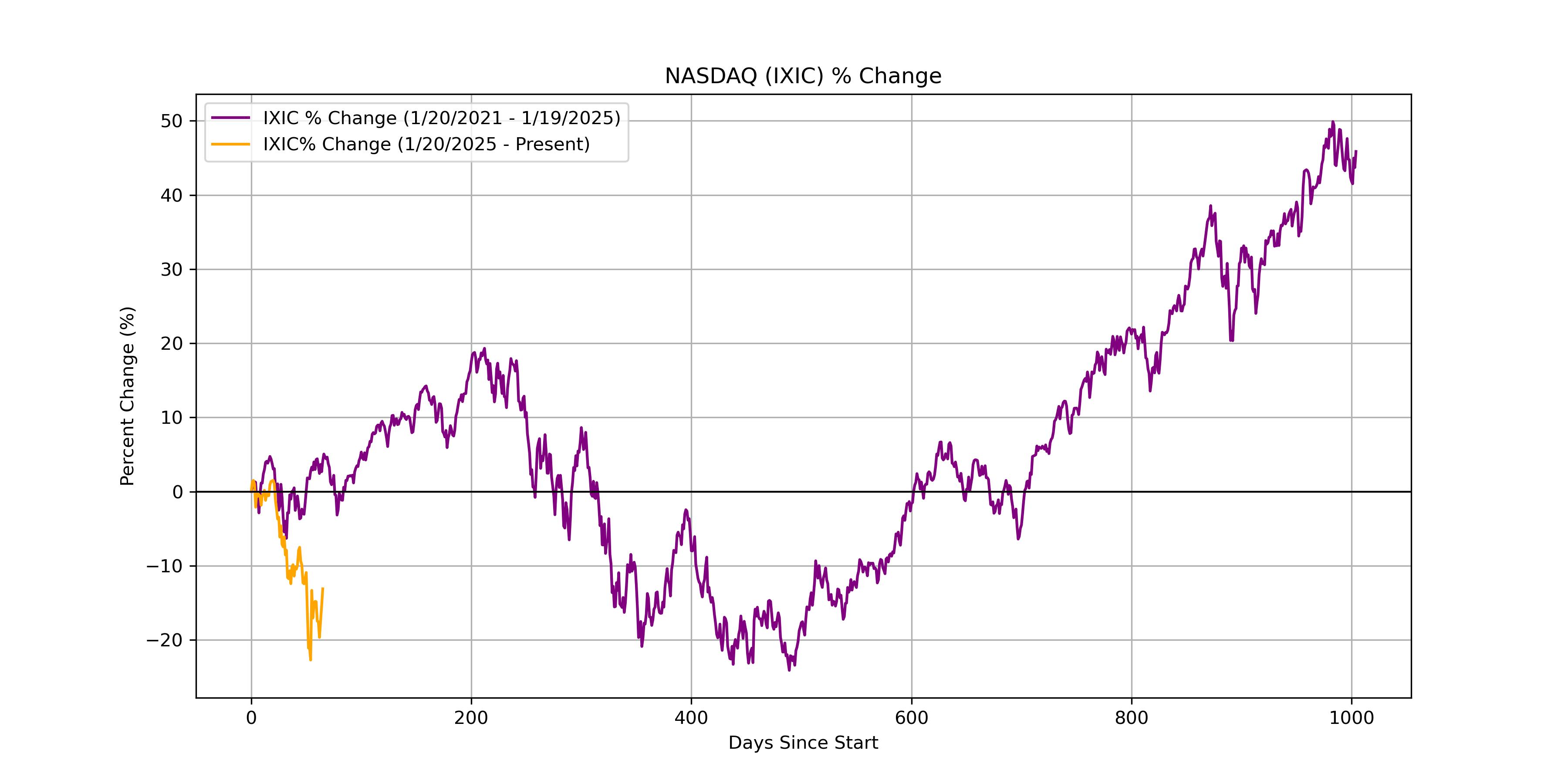
NASDAQ percent change chart
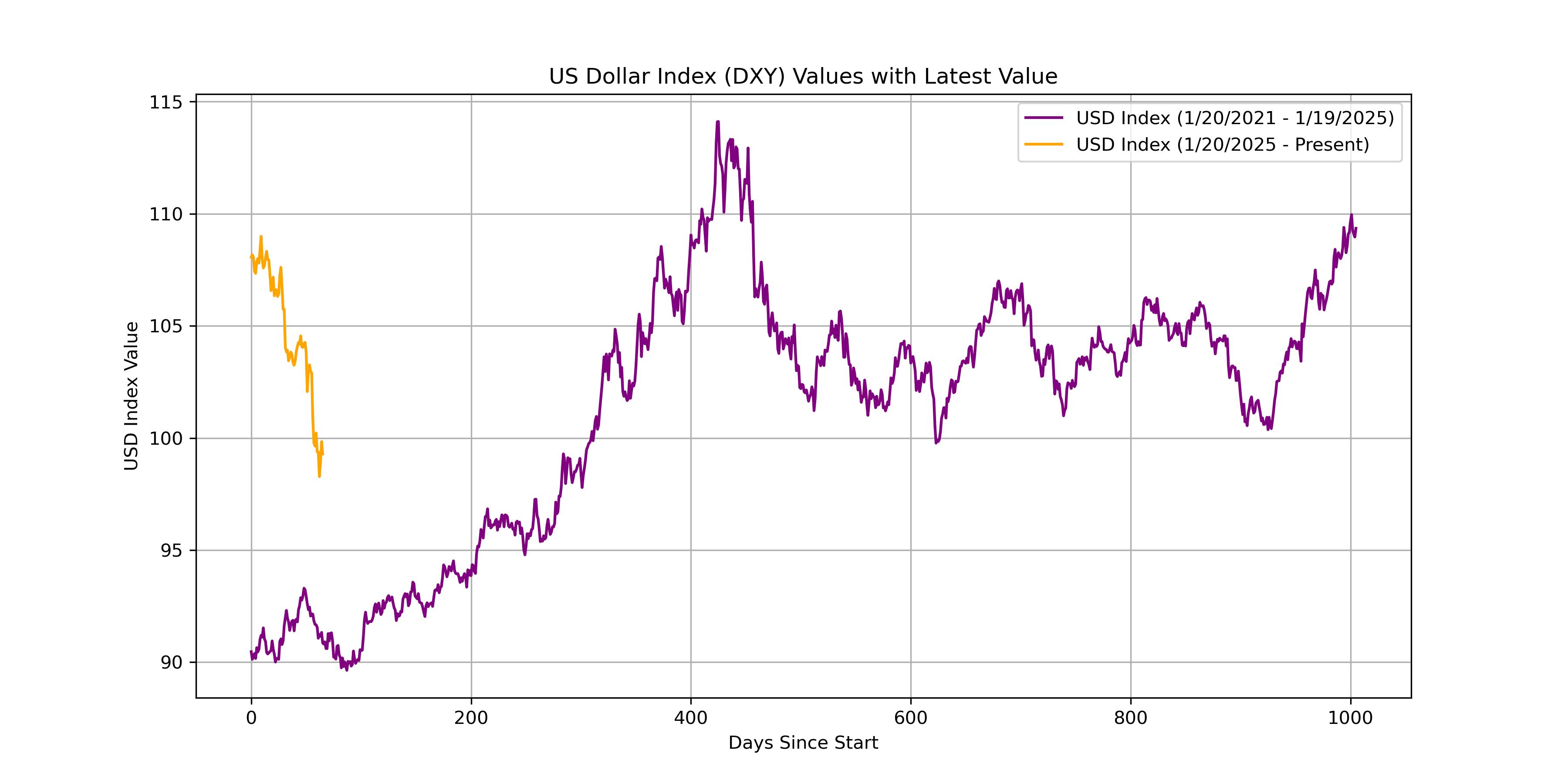
USD Index values chart
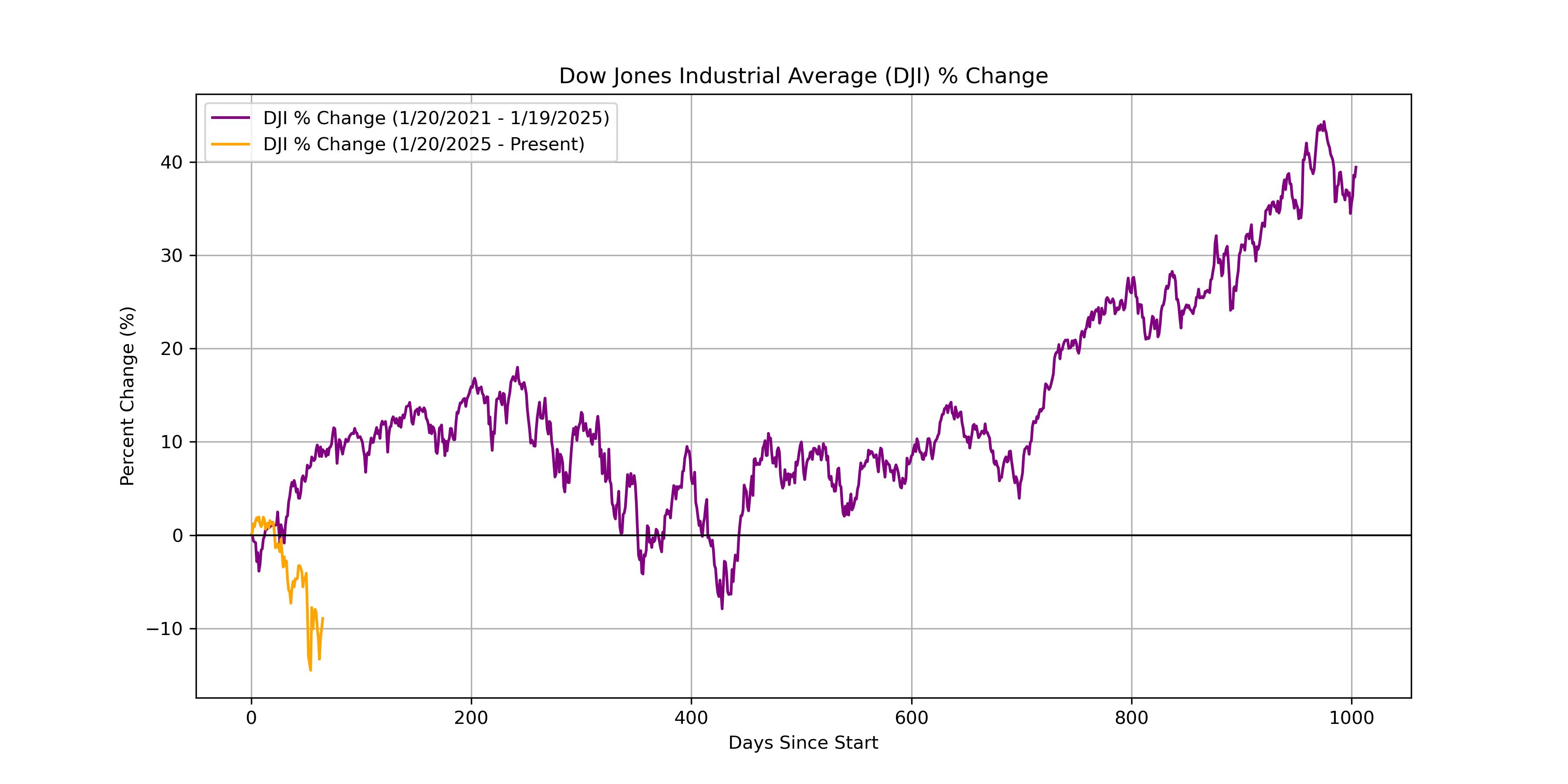
DJI percent change chart
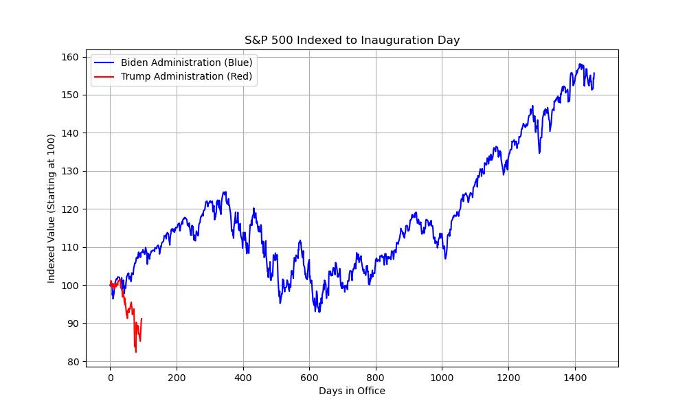
S&P 500 Inauguration Index
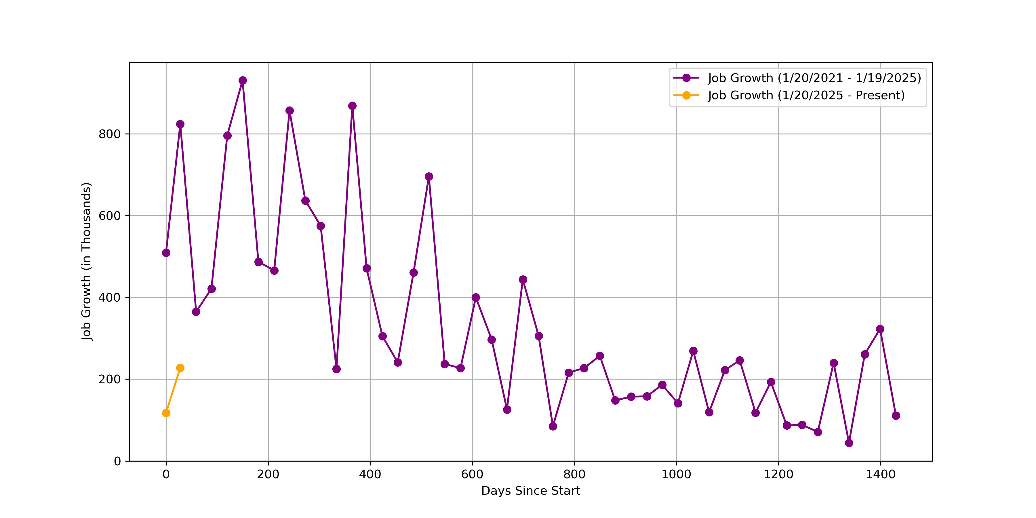
Job Growth chart
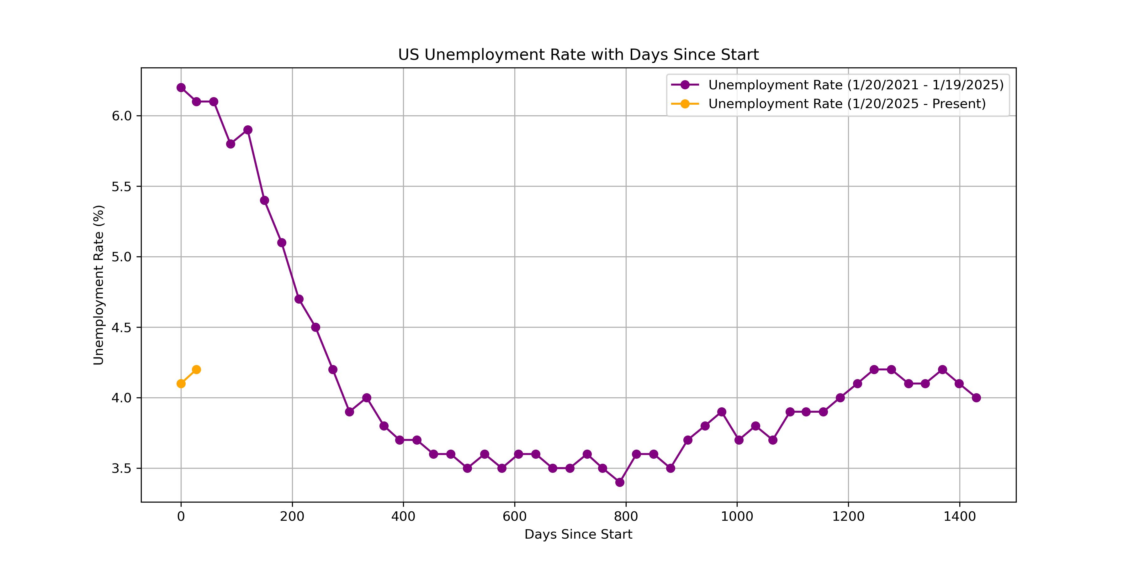
Unemployment Rate chart
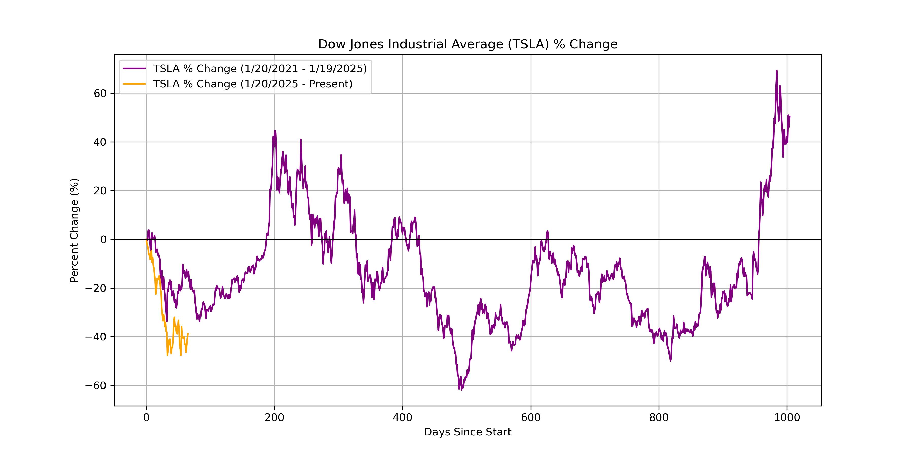
TSLA percent change chart
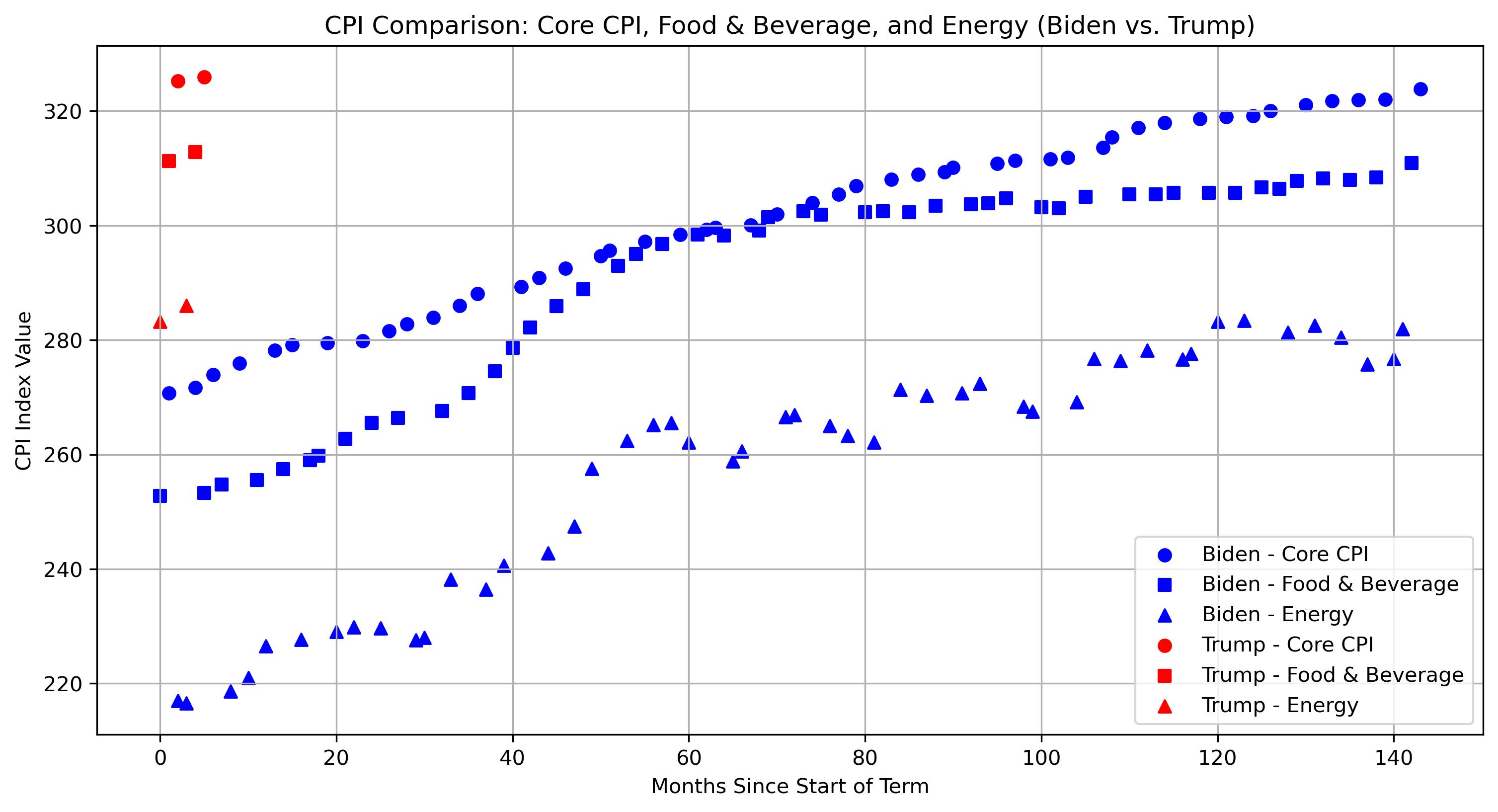
CPI comparison scatter
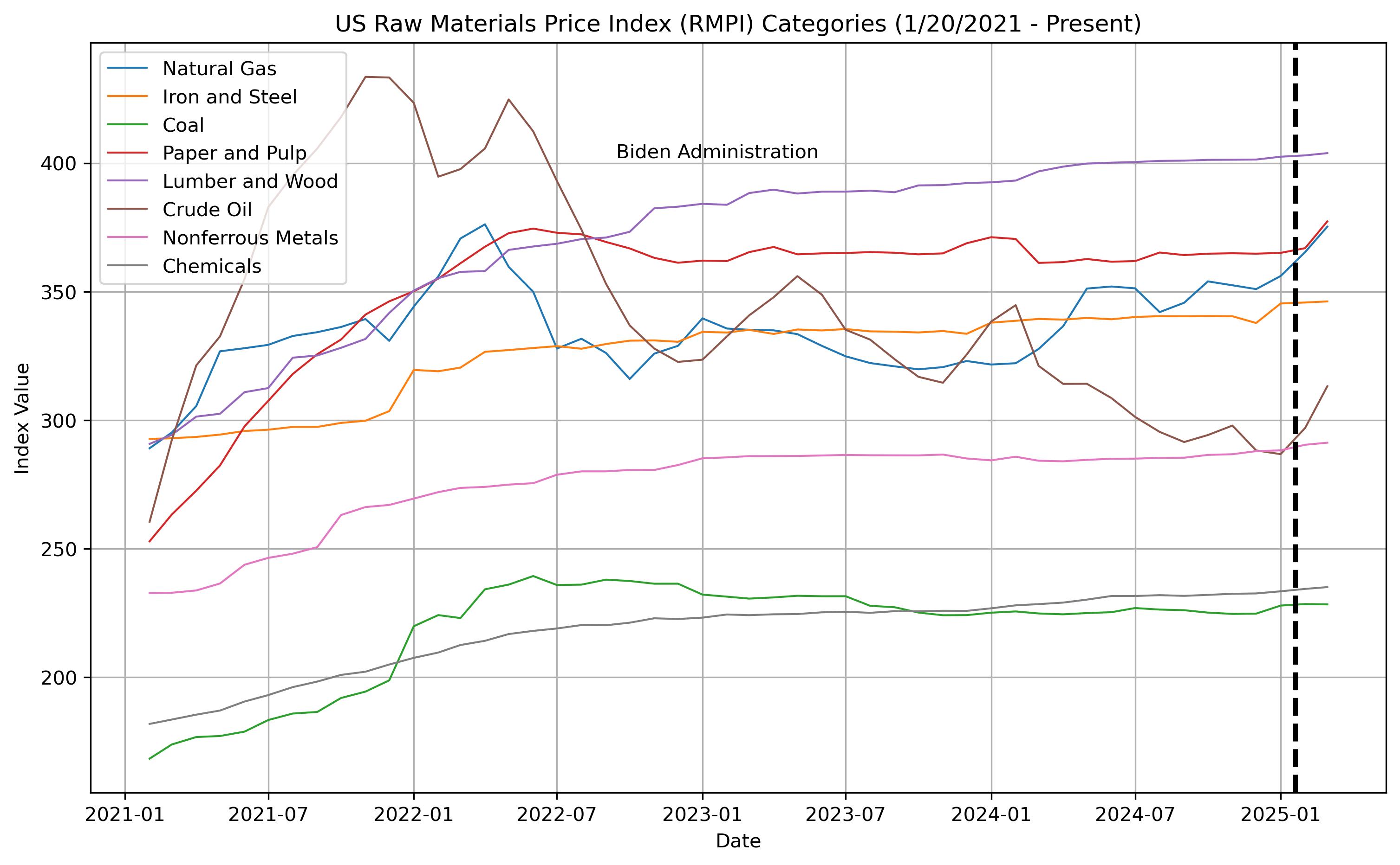
US RMPI comparison
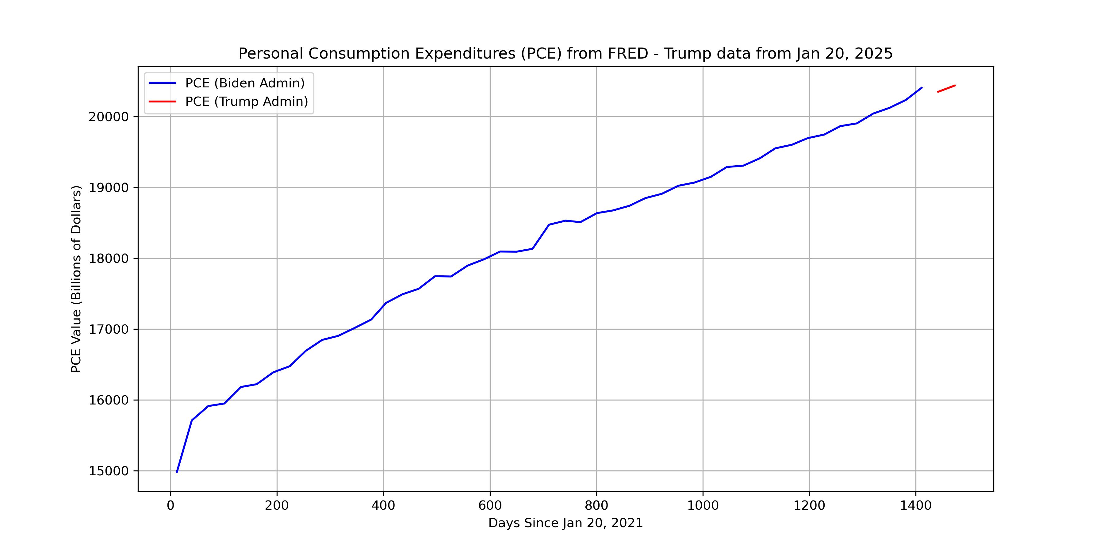
PCE Comparison
Impact of attacks on Canada for US producers as purchasing moved to Brazil
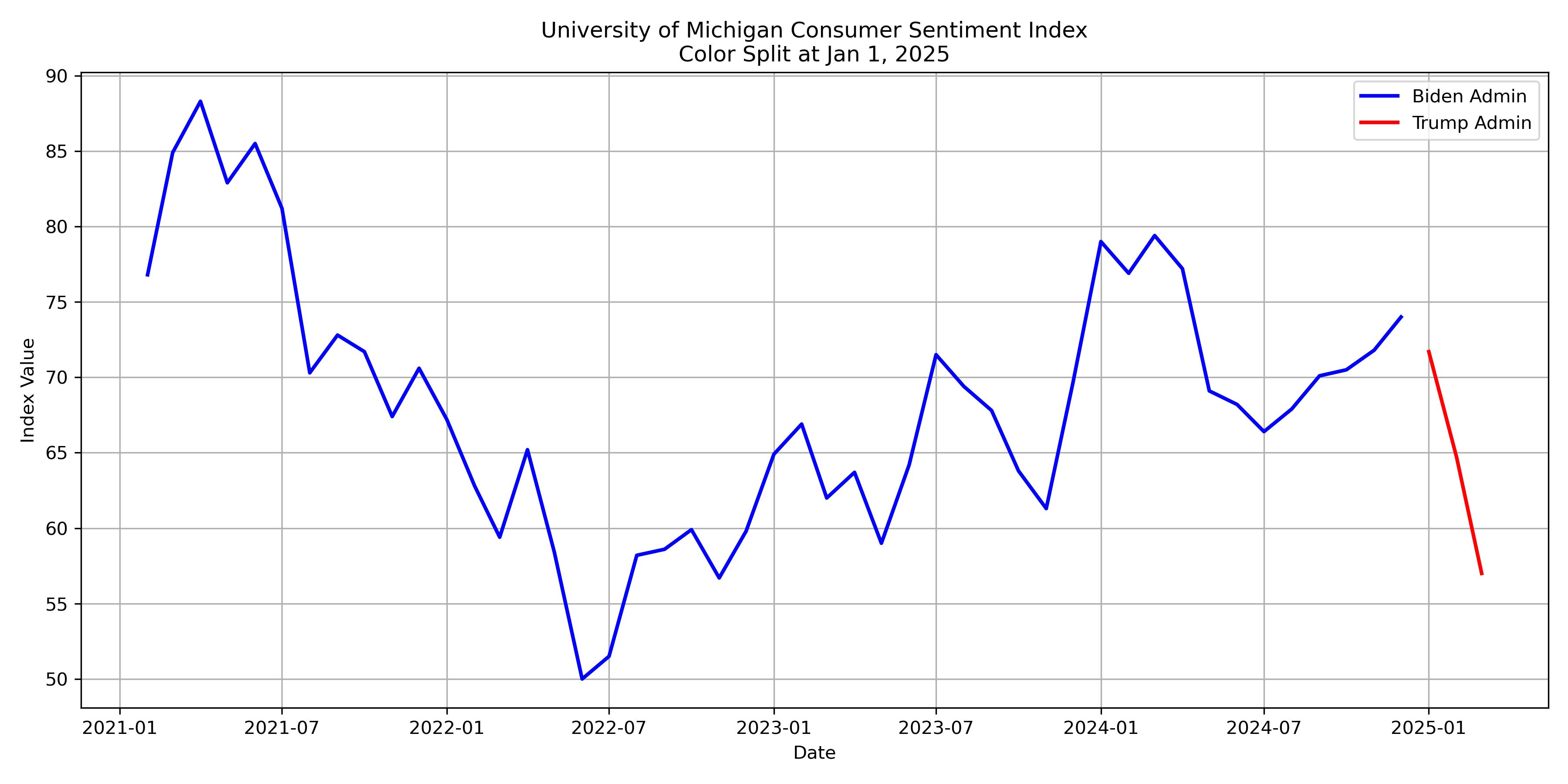
Consumer Sentiment values chart
This page offers an RSS feed that updates on the 1st and 15th of every month at 5 PM Central Time to keep you informed on the latest insights and data.